Global investment: lingering disappointment

Download the monitor

The improvement in the global economic backdrop since late 2013 has not provided the desired results when it comes to investment. Although the European recovery has shown a few positive signs, an overview of global investment trends continues to paint a disappointing picture:

  • In the U.S., where recent corporate earnings and leading indicators have fallen short of expectations;
  • In Japan, where the 2013 rally remains highly dependent on companies’ export performance, which has become somewhat of a mixed bag;
  • In the emerging world, where many Asian countries are confronted with excess capacities, at a time when most big countries are now paying the price for their structural shortcomings;
  • In Europe, where – unlike the rest of the world – leading indicators are actually encouraging: could the region rise to the challenge? Of course, such a scenario is unrealistic

The extended absence of an improvement in investment prospects is one the most troubling constraint for future economic development. We discuss this topic in further detail in « Investment inertia: what is at stake« .

Mr. Draghi Seems Quite Sure of Himself…

Download the article

The President of the ECB is confident in his ability to stare down deflation risk and bring the inflation rate up to its official target of 2%…on a 2016 horizon. Well that was reassuring; the euro celebrated the news by increasing to USD 1.386 this morning, a record since October 2011! Could we have expected anything different? Apparently not. The ECB wasn’t about to shoot itself in the foot by announcing that its forecast pointed to a deflationary scenario, tacitly recognizing that it would fail in its deflation battle.

Global Inflation – Disinflation Is Gaining Ground Across the Globe

Download the monitor

At the global level, disinflation is gaining ground. After a temporary rebound during spring, global inflation continued its downtrend in the second half of 2013 and ended the year at 3.2%. Inflation remains very weak in the developed world, at 1.3% in December, and has also sagged in many emerging markets in recent months, to finish 2013 at 6.1%.

In fact, as of December 2013, nearly half the countries (39) in our sample of 80 countries had inflation rates of less than 2%, which is markedly higher than a year ago (24). These figures have seen the addition of a growing number of Asian economies (6), the United States and Canada as well as all 27 members of the EU – without exception. Moreover, the number of countries with moderate inflation (3-4%) decreased sharply while the proportion of high-inflation economies (>6%) has not changed considerably and includes African countries and conflict-plagued countries for the most part.

  • Disinflation Is Gaining Ground Across the Globe
  • Commodity Prices Easing
  • Price Picture Still Mixed in EMs
  • Deflation Risk Remains High in the West  
  • United States, Not Quite in the Clear Yet
  • Euro Area, Deflation Risk Spreading to Core
  • Imports, an Additional Source of Disinflation
  • Increase in Real Interest Rates, the Bigger Threat

Scenario 2014–2015 : The Roller Coaster Economy

Download the article

2014 is off to a positive start: U.S. growth is trending upward, the euro area is pulling out of recession, Japan is reaping the benefits of its competitive strategy, and world trade is picking up. All these bright spots should be enough to end two years of global deceleration and bring about a return to growth of over 3 percent this year. But while this is certainly good news, it doesn’t tell us much about the key challenges ahead. To understand them, we need to address the much more complex question of whether 2014 will usher in a second leg of the global recovery—one that is sufficiently sturdy to ensure a lasting upswing and leave five years of convalescence well behind us. As things now stand, we feel we still have two good reasons for assuming it won’t:

  1. The deleveraging process is still producing dysfunctional effects around the world.
  2. Five years of crisis have seriously eroded the global economy’s growth potential and its ability to handle the higher interest rates the current upturn will inevitably entail.

This suggests that we are in for a period of economic instability. We are therefore forecasting that after 3.5 percent growth in 2014, global GDP will increase by only 3 percent in 2015.

The upturn, then, is likely to be short-lived, yet it’s still a reality—meaning it will necessarily affect market expectations.

We are sharply raising our long-term interest-rate forecast for the first half of 2014, but we predict backsliding before the year is out. Needless to say, there will be timid attempts at returning to normal monetary policy in the first few months of the year, but because they are unlikely to get very far, our outlook up to mid-2015 does not involve increases in key rates by the leading central banks—the Federal Reserve, the ECB, the BoJ.

Although initially encouraged by the improved economic climate to press ahead with tapering, the Fed may soon find itself overwhelmed by largely uncontrollable jumps in long-term Treasury yields.

All in all, this should be a highly volatile year.

World Trade: Recovering Without the Emerging Markets

Download the monitor

World trade has bounced back a bit since the end of summer. The improving European economy is one big reason. For its part, US demand has been trending more favorably since mid-year. And lastly, Japanese imports are ramping up, posting year-on-year volume growth of 5% in recent months despite significant yen weakening. So the improvement is broadly based and starting to have an impact on activity, at least in the developed countries.

Which means that, yes, this rosy picture leaves out the emerging countries, which continue to grapple with unusually soft growth in demand for imports. The reason for the anomaly? China is buying less, which is hurting export activity in the other emerging countries; Japan has reasserted itself; and demand for capital goods is sluggish. As a result, the driving force behind intra-regional Asian trade – and trade among emerging countries in general – has slackened considerably.

These trends take some of the luster off of the enthusiasm sparked by the encouraging signs coming from the developed world.

Commodity prices: what we would like to see, what hints they are giving

Commodity prices: what we would like to see, what hints they are giving

We got off on a good foot this week, with some reassuring news for once: the likely decline in oil prices stemming from progress on negotiations to halt the development of nuclear weapons in Iran. As we are reasonably confident that this week’s agreement will have an impact of at least $10 per barrel, we decided to take a closer look at what is, at first glance, good news for the world economy.

So, why don’t we just take the news at face value?

Is France doing as poorly as everyone says?

Coming on the heels of last week’s dispiriting PMI data, the results of the latest INSEE survey are reassuring. Not only do the results debunk the scenario of a slide back into recession that some were quick to assert after the PMI release, but a detailed analysis even shows that there is reason for hope.


What Pocket Change Can Tell Us About Past -and Future- Inflation

Download

When you get back from an overseas vacation, you’re often left with a bunch of small foreign coins in your pocket. You typically end up stashing them away in a junk drawer as soon as you get home, and this is precisely what I was in the process of doing after a recent trip to the U.S. when a penny dated 1964 caught my eye. I then looked more closely at the dates on my assorted pennies, dimes, nickels, and quarters. I even added my daughter’s coins to the mix. Soon intrigued by this journey back through time, we decided to group the coins by decade. What we found was startling: out of the 107 pennies left from our trip this summer, 3 were from the 1960s, 12 from the 1970s, and 11 from the 1980s. In other words, 24 percent of our lowest denomination coins came from years of double-digit inflation—when the coin mints apparently ran non-stop.

But what about the ensuing decades? Could we see the effects of the subsequent disinflation in our sample, given that our sample is necessarily biased by the lesser erosion in the supply of recently-minted coins? We had 13 coins from the 1990s and 18 from the 2000s. How could we possibly prove that once the time factor is taken into account, this is a much smaller proportion of coins relative to that from the inflationary decades? It seemed a hard circle to square. We were about to give up when we found some coins we had overlooked—our group from 2010 to 2013. There were many more of these, of course: 50 for a period of only 3.5 years—the equivalent of 142 coins per decade!

This shed an entirely new light on our figures. We realized that since we may safely assume the rate of erosion remains pretty much the same from one decade to the next, we can estimate the “erosion-corrected” size of a group of coins from a given decade by “reverse discounting” its actual size by an erosion factor. So we found a pen and did some back-of-the-envelope calculations. First we used an annual erosion rate of 5.5 percent, which was the growth rate of the M1 money supply in the U.S. over the period we were looking at. Next we used an annual erosion rate of 6.7 percent, which was the average annual growth rate of U.S. GDP over the same period. As it turned out, 6.7 percent was closer to what our pocket-change sample suggested.

Theoretically, this gave us a comparable, erosion-corrected total number of coins for each decade. When we restated our results using a base value of 100 for the 1960s batch, we found:

  • The erosion-corrected total peaked in the 1970s, at 234 using the 5.5 percent erosion rate and 209 using the 6.7 percent erosion rate;
  • The total then decreased steadily and hit a low, in the 2000s, of 70 at the 5.5 percent erosion rate and 45 at the 6.7 percent erosion rate;
  • The total rebounded sharply for our very last group of coins, those from 2010–2013, reaching a new high of 318 at the 5.5 percent erosion rate and coming in just below the 1970s value at the 6.7 percent erosion rate.

As you may have guessed, we couldn’t resist plotting our results alongside inflation for the same decades. Unsurprisingly, the curves matched up beautifully.
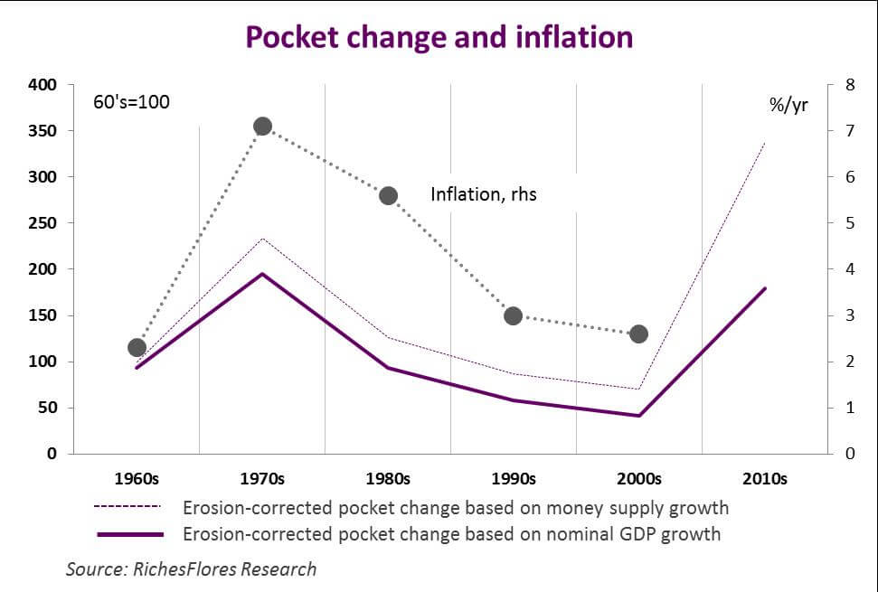
Pocket Money and Inflation


So what’s the moral of the story? Given the pace at which the amount of money in circulation has been growing since 2010, the U.S. appears on track for high inflation once it pulls out of the crisis. And we stand by our prediction even though the process seems to be taking longer than expected. An era of rising prices is already a palpable prospect.

World Growth Monitor

Download the monitor

Going it alone. The global economic picture is unquestionably looking brighter. Unlike previous recoveries, however, this one is fueled above all by consumer spending. The trend is especially noteworthy in Europe now that austerity policies have been scrapped. But it can also be observed in the United States—since the country has steered clear of the fiscal cliff dangers at the start of the year—and Japan, where the Abe administration’s first moves have lifted the spirits of local consumers. Even in China, sustained consumer spending is what has offset the negative impact of an end to export support. So on the whole, the environment is more encouraging. Yet the missing ingredient here is what proved to be one of the key drivers of global growth in the 1990s—world trade. This has two main implications:

  1. Global growth will be weaker than in the past, and will stay that way for some time.
  2. There will be greater risk for economies that are still too dependent on exports, i.e., the emerging economies in general and more specifically those suffering from structural imbalances—Brazil, India, and South Africa—and increasingly burdened by mounting current account deficits.