Now What Do We Do?

Download
The raft of data coming out of the euro area in recent weeks has been more and more mediocre and has erased all doubts: the strategy for extricating the economy from the crisis in the past few years has been a failure. None of the mechanisms born of resulting from decisions made by European leaders have delivered results or are about to:
-the structural policies aimed at improving competitiveness have failed, because global trade is tanking
-as proof: Germany’s export outlook is sputtering and the ability of the euro area’s biggest economy to act as the region’s growth driver (i.e. its “appointed” role) is going up in smoke;
-fiscal austerity’s only effect, under such conditions, is to fuel deflationary pressures and are counter-productive in controlling public debt levels.

These failures hardly come as a surprise. Like many of our peers, we have been decrying these shortcomings but did we really need to spell them out before hoping to make a convincing enough argument to effect the urgent change in the direction of European economic policy? With the situation becoming increasingly dire, where should, at present, our fears and hopes lie?

What Pocket Change Can Tell Us About Past -and Future- Inflation

Download

When you get back from an overseas vacation, you’re often left with a bunch of small foreign coins in your pocket. You typically end up stashing them away in a junk drawer as soon as you get home, and this is precisely what I was in the process of doing after a recent trip to the U.S. when a penny dated 1964 caught my eye. I then looked more closely at the dates on my assorted pennies, dimes, nickels, and quarters. I even added my daughter’s coins to the mix. Soon intrigued by this journey back through time, we decided to group the coins by decade. What we found was startling: out of the 107 pennies left from our trip this summer, 3 were from the 1960s, 12 from the 1970s, and 11 from the 1980s. In other words, 24 percent of our lowest denomination coins came from years of double-digit inflation—when the coin mints apparently ran non-stop.

But what about the ensuing decades? Could we see the effects of the subsequent disinflation in our sample, given that our sample is necessarily biased by the lesser erosion in the supply of recently-minted coins? We had 13 coins from the 1990s and 18 from the 2000s. How could we possibly prove that once the time factor is taken into account, this is a much smaller proportion of coins relative to that from the inflationary decades? It seemed a hard circle to square. We were about to give up when we found some coins we had overlooked—our group from 2010 to 2013. There were many more of these, of course: 50 for a period of only 3.5 years—the equivalent of 142 coins per decade!

This shed an entirely new light on our figures. We realized that since we may safely assume the rate of erosion remains pretty much the same from one decade to the next, we can estimate the “erosion-corrected” size of a group of coins from a given decade by “reverse discounting” its actual size by an erosion factor. So we found a pen and did some back-of-the-envelope calculations. First we used an annual erosion rate of 5.5 percent, which was the growth rate of the M1 money supply in the U.S. over the period we were looking at. Next we used an annual erosion rate of 6.7 percent, which was the average annual growth rate of U.S. GDP over the same period. As it turned out, 6.7 percent was closer to what our pocket-change sample suggested.

Theoretically, this gave us a comparable, erosion-corrected total number of coins for each decade. When we restated our results using a base value of 100 for the 1960s batch, we found:

  • The erosion-corrected total peaked in the 1970s, at 234 using the 5.5 percent erosion rate and 209 using the 6.7 percent erosion rate;
  • The total then decreased steadily and hit a low, in the 2000s, of 70 at the 5.5 percent erosion rate and 45 at the 6.7 percent erosion rate;
  • The total rebounded sharply for our very last group of coins, those from 2010–2013, reaching a new high of 318 at the 5.5 percent erosion rate and coming in just below the 1970s value at the 6.7 percent erosion rate.

As you may have guessed, we couldn’t resist plotting our results alongside inflation for the same decades. Unsurprisingly, the curves matched up beautifully.

Pocket Money and Inflation


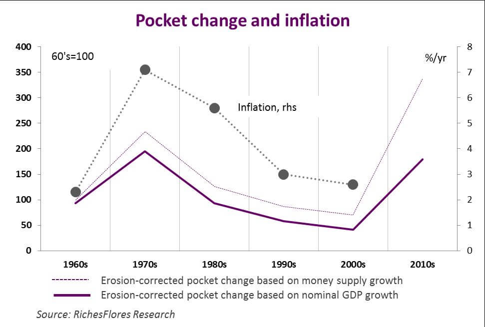
So what’s the moral of the story? Given the pace at which the amount of money in circulation has been growing since 2010, the U.S. appears on track for high inflation once it pulls out of the crisis. And we stand by our prediction even though the process seems to be taking longer than expected. An era of rising prices is already a palpable prospect.

How Effective is the Wealth Effect?

Download the article

The wealth effect—the increased consumer spending thought to result from rising financial and real estate asset prices—is frequently cited as a key argument for renewed faith in the U.S. economy today. That faith, however, may soon prove to be misguided, as we will attempt to show in this paper.

Economists use the term wealth effect in a very precise way: to explain how household savings patterns shift in response to changes in household net worth. When net worth goes up, due to an increase in the assessed value of homes or to rising stock prices, for example, people tend to set a smaller share of their wealth aside—in other words, their personal savings rate goes down, leaving more money for consumer spending. The term wealth effect basically refers to this higher consumption.

The wealth effect was particularly significant during the 2000s. It isn’t hard to demonstrate, for example, that in every year from 1998 to 2007, rising property values alone shaved as much as one percent off of the U.S. household savings rate. This made it possible for consumer spending to grow faster than disposable income, which had slowed as a result of weak job creation. For one thing, the perception of greater wealth created by rising asset prices tends to reassure households and boost consumer confidence in ways that encourage spending. For another, in countries with highly developed mortgage markets, increased net worth improves household balance sheets and enables homeowners to borrow more extensively. The macroeconomic benefits often produced by these factors would, of course, be particularly welcome in the United States today, since the Federal Reserve’s policies have turned out to be more effective in driving up assets prices than in stimulating the broader economy.

However, a number of problems are likely to prevent the wealth effect from operating as in the past:

  • The first, and by far the biggest one, is the current savings rate in the U.S. Because the processes described above don’t directly generate income, they can’t influence growth unless consumers dip into their savings. This means that the strength of the wealth effect depends to a large extent on how high the personal savings rate initially is. As it turns out, that rate was equal to just 2.5 percent of U.S. disposable income in April, leaving very little room, if any, for a further decrease.
  • The second problem hinges on how much debt American households already carry and on whether paper wealth gains will enable them to borrow more. The answer is: they won’t unless those households can afford a higher debt ratio—a rather improbable scenario at this stage. To understand why, it is important to bear in mind the distinction between the household debt service and household debt ratios. Due to falling interest rates—which have allowed U.S. homeowners to refinance their mortgages—and to extensive debt cancellation brought about by the wave of foreclosures in recent years, debt service payments as a proportion of disposable income have plummeted. This decrease in the debt service ratio has made more money available to households and has therefore been a major contributor to the recovery in consumer spending over the past two years. But this process can’t rightfully be considered a wealth effect, and since it is already behind us, it is unlikely to be much of a stimulus to future consumption. The debt ratio, which measures the stock of household debt as a proportion of income, is the only reliable predictor of household borrowing capacity. Unfortunately, it has remained stubbornly high: barely 20 percent below its pre-crisis peak, and thus well above its long-term average. So there is probably very little scope for a substantial increase in U.S. household debt—which in any case would be a bizarre development right after a debt crisis of the kind we have just been through.

All this, along with low job creation numbers, should make it clear why we have more doubts than most on the prospects for buoyant consumer spending in the U.S.

Une_anglais